Payara InSight allows real-time visualisation and alerting for server and web application metrics.
It consists of a server module responsible for collecting a multitude of metrics from all nodes which are accumulated on the DAS to feed data to its frontend which visualises the data as a web-application deployed on the DAS.
The metrics include server metrics from different sources within the server as well as metrics defined in user applications using MicroProfile Metrics and metrics derived from MicroProfile Health checks.
Enabling the GUI
By default, the GUI of Payara InSight is automatically enabled for the production domain.
Links can be found on the Common Tasks home page of the Admin GUI in section Monitoring or on the Monitoring Data page.
For domain1 the GUI is not enabled by default and the set-monitoring-console-configuration is used to enable it on demand.
To enable the GUI manually run the following asadmin command:
asadmin> set-monitoring-console-configuration --enabled=true
Payara InSight is now available at http://localhost:8080/monitoring-console/ . Like the admin GUI, it only runs on the DAS.
To stop the GUI run:
asadmin> set-monitoring-console-configuration --enabled=false
Stopping the GUI does not disable the data collection. This is a background process that is controlled separately as described in the next section.
| Payara InSight is only bundled with Payara Server Enterprise distribution. |
Enabling Data Collection
The collection of monitoring data gets enabled and disabled in connection with the general configuration: Monitoring ⇒ Monitoring Service ⇒ Enabled. By default, this settings is enabled.
To remove only the monitoring data collection from the server without disabling the monitoring service itself delete the monitoring-console-core.jar from the /glassfish/modules folder of your installation(s) and restart the server.
|
Graphical User Interface
When Payara InSight is enabled open the home page at /monitoring-console/ (usually on port 8080).
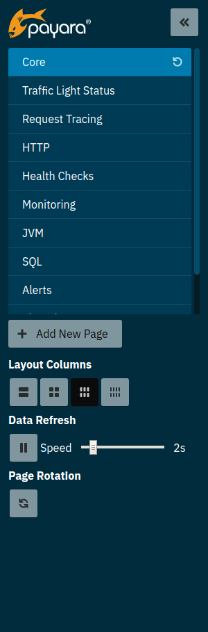
The GUI ships with a set of preconfigured pages each focussing on a different aspect of the server.
Some metrics are only available when the monitoring configuration of certain server parts is set to HIGH. Widgets that do depend on such a configuration changes let you know how to enable the metrics.
|
Pages
Payara InSight is organized in fully customisable pages. A page is a collection of widgets arranged in columns. Usually, pages are focused on visualising metrics of a specific area of the server, like HTTP or request tracing. The pre-configured pages are a starting point that can be changed and extended by the user. New custom pages can be created and populated with arbitrary metrics.
Switching Pages
To switch page use the left menu.

Since version 5.20.0, each page switch also updates the URL making the URL bookmarkable. URLs can be copied and shared with others to direct them to particular pages.
Updating URLs after switching pages also means that navigation based on the browser’s page history is possible and the back button can be used to already visited pages.
Changing Page Layout
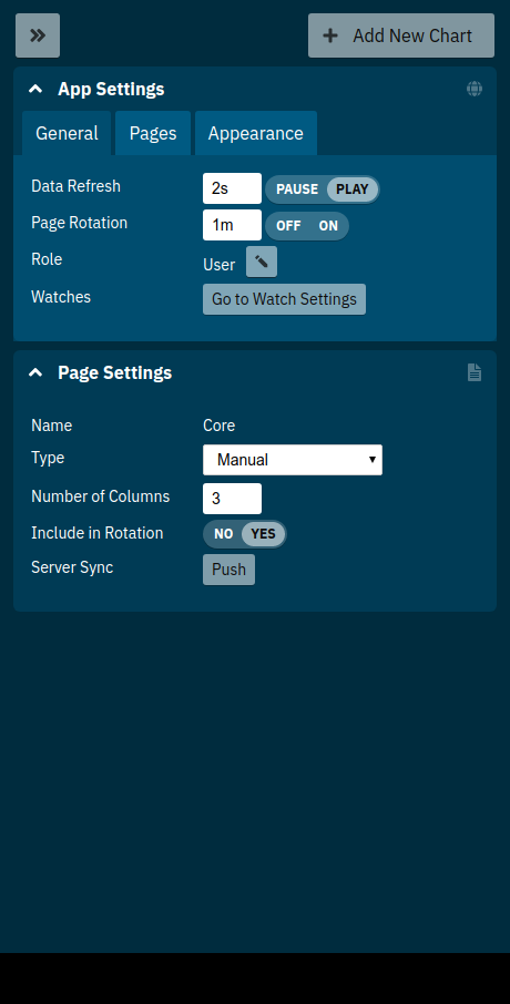
Each page uses a column layout of one or more columns. The number of columns for a page can be changed using one of the Layout Columns quick access buttons.
Changing the column layout of a page does not change the preferred position of the widgets. If a widget is set to column 3 but a 2-column layout is used all widgets of the 3rd or 4th column get pushed to the 2nd column instead. This allows switching layouts based on the viewing device without redoing the configuration entirely.
Changing Page Update Interval
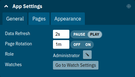
By default, the graphs on a page update every 2 seconds. To control the interval use quick access in the left side menu or General application settings.
The interval can be paused and continued without changing the interval duration by using the play/pause toggle next to the interval setting.
Adding Pages
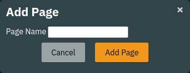
To add a new page expand the left menu, click the Add New Page button below the list of pages and enter a name for the new page in the dialogue.
Usually pages are populated manually. Use the Add New Widgets button in the right sidebar (+ when minimized) to populate the page and configure the added widgets.
Alternatively pages can use a query to automatically populate the page with widgets for those metrics that match the query. To use a query page open the page settings and switch the Type to Query:
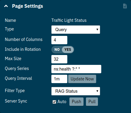
Fill in Query Series and Query Interval and click the Update Now button.
| Query pages are repopulated in intervals. Any changes to individual widget settings will be overridden with the next population. However, queries can be used to initially populate a page and then switch the page back to Type: Manual so that changes to the widgets are kept. Naturally this comes at the downside that metrics no longer are added to the page automatically. |
Learn more about series patterns as used by query pages.
Deleting a Page
To delete a page open the left sidebar and click the on the trash icon next to the page name in the list of pages you want to delete.

Confirm the deletion.
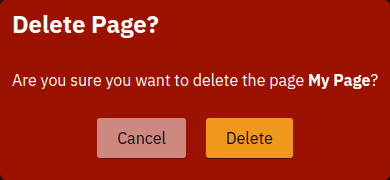
| Pages that are based on a preset cannot be deleted. They can only be reset to their preset configuration. |
Reset a Page
When the configuration of a preconfigured page or any of the widgets on it was changed by the user the page can be reset by clicking the Reset icon next to the page name in the expanded left side menu.

Confirm the reset.
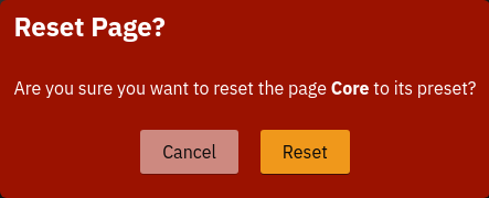
| The reset will affect all widgets and the general page settings of the currently shown page. All changes made previously by a user will be overridden. |
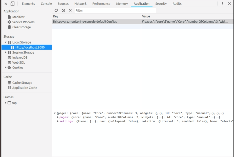
| To reset all pages and remove all user-created pages, clear the browser’s local storage of Payara InSight. |
Page Rotation
Payara InSight is meant to be used to display metrics on status monitors. To allow viewing a variety of pages and their metrics on a single screen the pages can be automatically rotated showing each page for a configured interval duration.
To start or stop page rotation either use the quick access button at the button of the left side menu or use the toggle switch in the General application settings. This starts or stops the rotation immediately and each page is shown for the configured duration starting with the currently shown page.
The duration can be adjusted by changing the text field of the Page Rotation to another time value.
Use units to express the duration, as for example: 1min, 30sec.
Changes take effect immediately.
Individual pages can be excluded from rotation by toggling the Include In Rotation toggle to No in the page settings.
Page Management
Payara InSight uses the browser’s local storage to store the page and widget configuration. This means that, by default, changes to page configurations do not affect other users. To make pages available to others and to start from a common base configuration pages are explicitly shared and updated from a persistent server configuration.
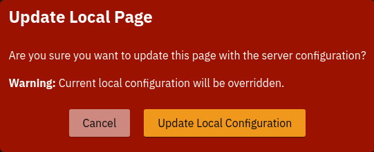
The chosen role controls the behaviour and available options for page management. It is the Administrator's role that is meant to manage the persistent server page configuration. The Administrator explicitly pushes local pages to the server to share and update their base configuration. Users and Guests pull the server configuration to update their local configuration with the base. The control remains with each user.
The Page Synchronisation dialogue shown when entering the GUI allows the user to pick the pages that should be updated (pulled).

By default, all pages available remotely that have not been changed locally are preselected.
| Guest automatically pull the servers base configuration, no dialogue is used |
The newest version is marked with an asterisk for easier orientation.
This dialogue can also be opened from the Pages application settings by clicking the Update Local… button for the Page Sync property.
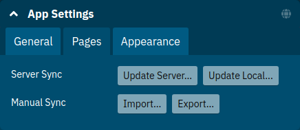
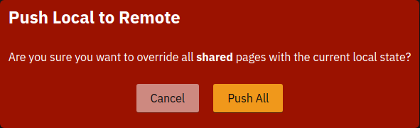
Administrators also find a button to Update Server… pages with any changes applied to local changes. This is only needed for pages that are not using auto_matic updates in their page settings. This simply should give administrators different approaches to managing the configuration of shared pages. To bulk update all server pages click the _Update Server… button and confirm the update:
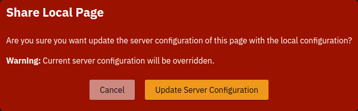
To share a page that so far is not part of the persistent server configuration open the Page settings and look for the Server Sync property.
Both Users and Administrators can Push a page to share or update the persistent server configuration or Pull the server configuration to update the local page. Administrators can also enable or disable the automatic page synchronisation. When enabled any local change done by an Administrator is automatically pushed to the remote configuration.
Both Push and Pull need to be confirmed.
Besides the managed page synchronisation which is using the persistent server configuration the local configuration can also be managed manually. To manually export pages click the Export… button and select the set of pages to export in the dialogue and confirm your selection by pressing Export
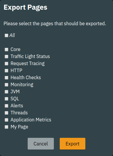
To manually import pages click the Import… button and select a file. The dialogue will show the list of pages contained in the file. Select the pages that should be imported.
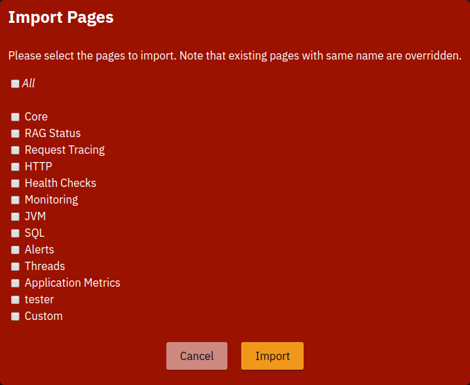
| Importing a page will override the local page with the same ID (name). Any customisation made to the local page will be lost. |
Changing User Role
A user of Payara InSight acts in one of three roles:
-
Guest: A user that uses Payara InSight only on occasion to check existing metrics on existing pages ("read-only" user).
-
User: A user that uses Payara InSight to experiment with its features without affecting others.
-
Administrator: A user that administrates the Payara InSight configuration that is the basis for other users.
When no role is set from previous sessions the user is asked to choose a role when opening the Payara InSight application.
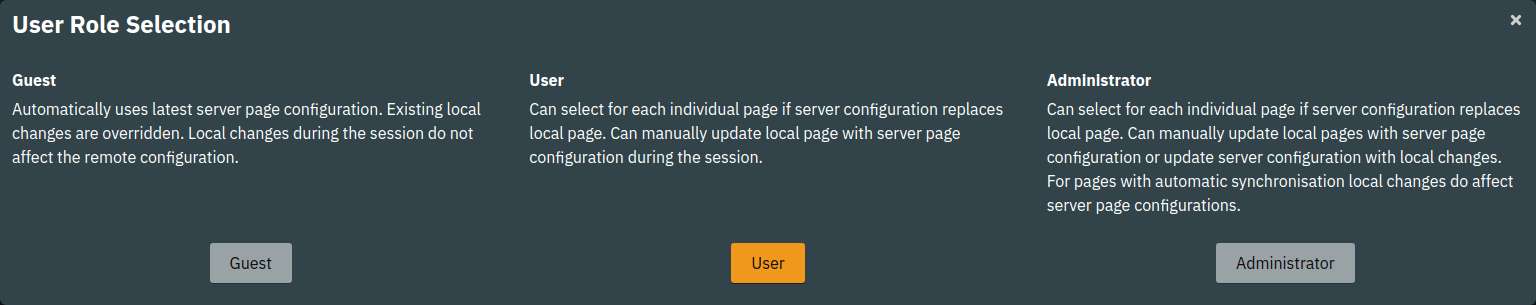
The selection can be changed at any time in the General application settings for Role.
| At this point, roles are not connected to accounts or other forms of permission management. Users can switch between the roles to suit their current intentions when using Payara InSight. We plan to connect roles to accounts and require a login in the near feature. |
Widgets
Widgets are the components that can be placed on a page to show a particular metric or a set of metrics. While there are different types of widgets usually a widget shows a line graph of one or more metrics for the entire cluster.
Adding a Widget
Widgets can be added to any page. Click the plus button in the minimized right side menu or the Add New Chart button when it is expanded.

This opens the Add New Widget dialogue.
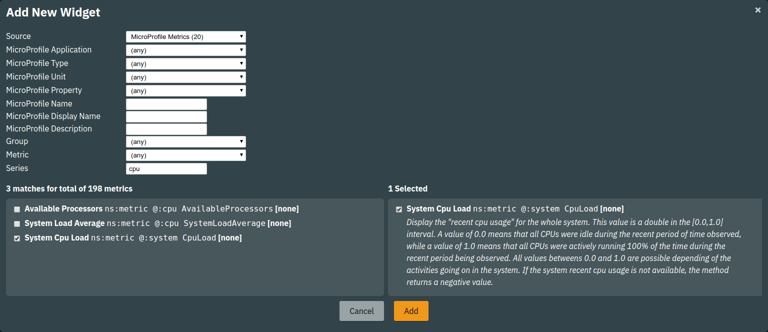
Use any one or combination of the filter dropdowns to select a subset of metrics and/or enter a query text in any of the free text search input fields to further narrow down the results. All matching metrics will be shown in the list on the left. Select one or more items. Selected metrics are shown in the list on the right. The search can be changed between selection.
Finally, confirm the selection by clicking the Add button of the dialogue.
Newly added widgets are automatically placed in a column so that widgets are evenly distributed on the page. Use the side panel widget settings to change the column, width, height or item position of the widget or use the quick menu for the widget by clicking the pencil symbol in the top right corner of the widget.
Configuring a Widget
To configure a widget select it by clicking on its title or the pencil icon in the top right corner of the widget.
This opens the right settings side panel and shows the detailed configuration of the widget. The side panel can be closed by either deselecting the widget, by clicking on its title again, or by clicking the collapse icon of the right sidebar.
| If the settings have been opened explicitly through the Settings menu an empty selection will not close the settings side panel. |
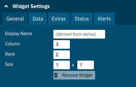
The General widget settings are concerned with the widget’s position within the page and its general appearance.
| Property | Default | Description |
|---|---|---|
Display Name |
(undefined) |
Optional name to customise the displayed widget title. If no name is given the Data ⇒ Series is shown. |
Column |
1 |
The column in the layout the widget prefers to be in. |
Rank |
1 |
Within columns widgets are sorted by their item value, lowest values first. The item position is automatically updated during page layout should it be needed. |
Size |
1 / 1 |
How many width (number of columns) and height (number of rows) the widget should span. Note that this is a target size. If page number of columns is reduced the width might be reduced to match the page layout. |
The Data settings are concerned with what and how the data is shown in the graph of a widget.
| Property | Default | Description |
|---|---|---|
Type |
|
Changes the type of graph used to show the metric. This also affects which data of the metric a widget is focussed on. Possible choices:
|
Mode |
(Default) |
If available for the type of widget the display mode can be switched between Table and List. Table view is best fitted for annotations that share common attributes, lists are better fitted for annotations with potentially differing attributes. |
Series |
- |
The metric key as given when adding the metric, use pencil icon to edit |
Unit |
|
The unit controls how the raw number of a metric is interpreted and represented e.g. when displaying in axis labels. The unit also controls what values are accepted as input for numbers, like thresholds, that are on the same axis. Possible units are: |
Unit 1/sec |
|
Whether or not to show the metric as a change per second (delta between two points in the series normalised to average delta per second). |
Upscaling |
(undefined) |
When defined all values are multiplied by this factor. This can e.g. be used to move a decimal range between zero and one to a percentage range 0-100. |
Upscaling decimal value |
|
Check to mark the metric as one that is provided as a decimal value during collection (floats or doubles and alike). This will then revert the conversion applied during collection which converts decimal values to an integer number with 4 available decimal digits by multiplying them by 10,000. So this divides values by 10,000 again to move them back into their original value range. |
Line Style |
(none checked) |
Options on how to display the current value line in the graph: Check Points to show individual data points on the line, check Curvy to use Bézier curves instead of straight line connections. |
Background |
Fill |
When Fill is checked the area between line and axis is filled. The background transparency can be configured globally in the Appearance application settings. |
X-Axis |
Labels |
Whether or not to show labels for the x-axis. |
Y-Axis |
(undefined) |
Set a minimum or maximum number for the y-axis instead. When not set range is derived automatically from the data points. |
Coloring |
Instance Name |
Used to select the colours the data is shown with. Instance Name will show data in the same colour that belongs to the same instance. Series Name shows the metric series in the same colour (independent of instance). This is individual to each widget. Result Set Index will show each matching series in a different colour. Instance and Series Name shows the same instance and series in the same colour. This is global. This means another widget using this colouring with the same instance and series will have the same colour as well. |
Configuring Widget Extras
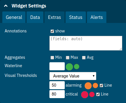
The Extras settings are concerned with additional information shown in or around the graph or widget content in general. This includes visual helpers that can be added to a graph of a widget in order to make it easier to for the user to quickly understand the data displayed. In particular these are reference lines and threshold indications.
| Property | Default | Description |
|---|---|---|
Annotations |
(checked) |
Whether or not to show annotations for in an alert table. |
Annotations (Fields) |
(blank) |
A comma or space separated list of fields to show for an annotation list or table. The given field order is reflected in the view. |
Aggregates |
(none checked) |
Check to add the all time minimum, maximum or average line to the graph |
Waterline |
(undefined) |
Adds a simple reference line that could mark a upper or lower limit. Enter in unit of y-axis, e.g. 20ms, 5s, 2GB, 4%, 123 |
Threshold Reference |
|
Controls what value the Alarming Threshold and Critical Threshold are compared to. Usually this is the most recent value but in some cases the all time minimum, maximum or average are useful too. |
Alarming Threshold |
(undefined) |
The limit for the "Alarming" state. If Critical Threshold is undefined or if its value is larger than this value the alarming threshold is exceeded if the reference value is larger than the threshold. Otherwise, if the Critical Threshold is lower than the Alarming Threshold, the threshold becomes 'inverse', and is exceeded when the reference value falls below the alarming value. When exceeded the status becomes "Alarming". Enter in unit of y-axis, e.g. 20ms, 5s, 2GB, 4%, 123 |
Critical Threshold |
(undefined) |
The limit of the "Critical" state. If Alarming Threshold is undefined or it’s value is smaller than this value the critical threshold is exceeded if the reference value is larger then the threshold. Otherwise, if the Critical Threshold is lower than the Alarming Threshold, the threshold becomes 'inverse', and is exceeded when the reference value falls below the critical value. When exceeded the status becomes "Critical", overrides status "Alarming". Enter in unit of y-axis, e.g. 20ms, 5s, 2GB, 4%, 123 |
Besides adding a reference line to the graph the critical and alarming thresholds affect the status evaluation.
Use the colour input to individually override the widget’s colour for waterline, alarming line or critical line in graphs. Press the button right next to it which shows the default colour as configured in the Appearance application settings to reset the individual colour to use the default setting instead. A colour set to the default changes with the default.
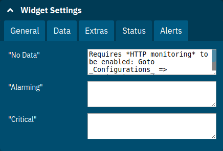
Configuring Widget Status Messages
The current value of a metric can automatically be categorised as a certain status. For example based on the threshold values of decorations or by encountered errors or missing data. The Status settings allows to set a custom message for a particular status.
| Property | Default | Description |
|---|---|---|
"No Data" |
(undefined) |
The message to show when no data for a metric is available. For example to hint about configurations needed to make the metric available. |
"Alarming" |
(undefined) |
The message to show when the threshold got exceeded and the status evaluates to Alarming. |
"Critical" |
(undefined) |
The message to show when the threshold got exceeded and the status evaluates to Critical. |
The messages support simple markup using *bold* and _italic_.
Configuring Widget Alerts
The values of metric series can be tracked by the server to report values that out of a healthy range. This is represented by states:
-
Red: values in this range indicate an unhealthy state
-
Amber: values in this range indicate a degraded state
-
Green: values in this range indicate a healthy state
-
White: values in this range are in no particular state (neither good or bad, maybe undecidable)
State changes to amber or red are reported as alerts. This is shown in the widget they affect. The settings allow filtering these related alerts to prevent them from showing. This makes sense on pages that have dedicated widgets to show alerts or just if users prefer to see the graph instead.
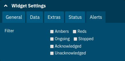
| Property | Default | Description |
|---|---|---|
Filter |
(none checked) |
Do not show (when checked) Amber and/or Red alerts, Ongoing and/or Stopped alerts, Acknowledged and/or Unacknowledged alerts. |
| If for any of these 3 groups of pairs both are checked no alerts would be shown. Widgets of type Time Curve automatically exclude stopped and acknowledged alerts to avoid cluttering the graph with alerts that aren’t relevant anymore. Use a widget of type Alerts Table to show all alerts according to the filter at all times. |
Handling Alerts
Alerts can occur when a watch is configured for a metric series. A watch describes the conditions and thresholds used to determine a state from the recent values of a metric series. It is either Red (unhealthy), Amber (degraded), Green (healthy) or White (undetermined). A Red or Amber state causes an alert that is shown on top of the graph.
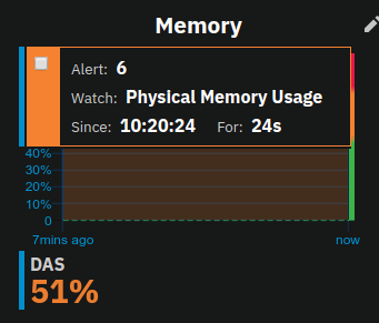
When an alert occurred for a metric shown in a graph the background of the line causing the alert is coloured in Red or Amber default colour until the alert is stopped.
Alerts are considered ongoing as long as the state is Red or Amber. If it is evaluated to Green or White ("unspecified") the alert stops. Stopped or acknowledged alerts are no longer shown on top of line graphs. Other ways to hide an alert from a line graph is to acknowledge the alert by checking its checkbox or to configure the widget’s Alerts Filter setting so that alerts generally aren’t shown for that widget.
To see even stopped or acknowledged alerts add a widget of type Alert Table.
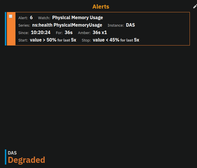
By default, an alert table shows all alerts including stopped and acknowledged alerts. Use the widget Alerts settings to exclude alerts with certain properties.
An alert table shows the overall state of each instance in the table’s legend.
As mentioned before the Alerts settings can equally be used for line graphs to create a more restrictive setting.
Removing a Widget
Any widget can be removed from any page. Click the pencil symbol in the top right of the widget or its title to open the widget’s settings. On the General widget settings tab you find the Remove button.
Confirm you want to remove the widget

Remember that a page originating from a preset can be reset to recover a widget that was removed accidentally.
Page Settings
Most of the page settings have already be described in context of the different page related user actions. The following tables are included for reference.
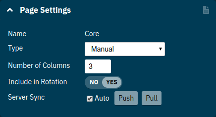
The common page settings are those used by pages of Type Manual and Query.
| Property | Default | Description |
|---|---|---|
Name |
- |
The name as given by the user when the page was created or as defined in the page preset, only user-created pages can be renamed |
Type |
|
|
Number Of Columns |
1 |
The number of columns available to place widgets in |
Include In Rotation |
Yes |
Yes: Page is included in the set of pages rotated during page rotation, No: page is excluded from this set |
Server Sync |
(checked) |
Auto: Changes made by an administrator to the page or the widgets of this page are automatically pushed to the shared configuration if and only if the page has been explicitly pushed to the shared configuration at some point in the past. |
Pages of Type: Query have more settings to configure the contents of the page.
| Property | Default | Description |
|---|---|---|
Max Size |
32 |
Maximum number of widgets added to the page when populating it from query matches (even if there are more metrics matching the query) |
Query Series |
- |
A series pattern used to query for metrics, matches are used to populate the page |
Query Interval |
|
The interval in which the query is run and the page is repopulated with matches |
Filter Type |
- |
When selecting a type only metrics inferred to prefer that type are shown on the page |
See Application Metrics page for an example of a query page.
Application Settings
The configuration that controls global properties of the Payara InSight user interface. It is stored in the browser’s local storage and thereby individual for each user. Currently these settings cannot be shared.
General Application Settings
| Property | Default | Description |
|---|---|---|
Data Refresh |
|
Interval duration used to update the currently shown page with new data (poll duration). To pause data update toggle the play/pause toggle switch. |
Page Rotation |
|
Duration each page is shown during a page rotation. To run or stop the rotation toggle the on/off toggle switch. See section Page Rotation for details. |
Role |
User |
Select the used user role. See section Changing User Role for details. |
Watches |
- |
Click the Go to Watch Settings button to open the Watch Management |
Pages Settings
The Pages application settings give access to different page management operations as described in detain in section Page Management
Appearance Settings
Newer versions of Payara InSight allow to configure the colours used in graphs. There is a global colour configuration affecting all graphs.
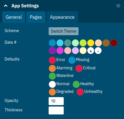
| Property | Default | Description |
|---|---|---|
Scheme |
(Payara) |
The selected scheme is applied to set the colours palette for Data as well as Defaults and Opacity. This is only a convenient way to switch all of these between different settings. The individual properties can be changed afterwards as usual without affecting the scheme. |
Data # (Palette) |
(colours of Payara scheme) |
The list of colours to use when colouring data series in graphs. This is the line colour in line charts or the bar colour in bar charts. Background will use the same colour with Opacity. Add new colours by using the |
Defaults |
(default of Payara scheme) |
Sets the default colours for Waterline, Alarming and Critical as well as Red, Amber, Green and White state lines, backgrounds and texts. Some of these can be individually overridden in the widget’s configuration for these lines. |
Opacity |
10 |
Background opacity for lines or bars in graphs, 0 (fully transparent) to 100 (solid). |
Thickness |
(3) |
Line width on a scale 1-8. Each point corresponds to 0.5px with. Default for lines in a line graph is 3, so 1.5px. |
Themes act as a (p)reset of the data colour palette, default colours and Opacity setting. When switching theme these settings are reset to the theme’s value.
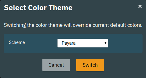
Any further customisation of individual colours can and should be done after applying the theme of choice as switching theme would reset such customisations again. Currently theme settings are individual to the browser and cannot be shared or preconfigured for other users.
Watch Management
A watch describes the conditions to meet to start and stop alerts in relation to a specific metric. For example to get an alert every time an HTTP request causes a server error (responds with any of the 5xx status codes) a custom watch is installed. This is very similar to a custom health check that could be linked to any metric available where the thresholds are defined as part of the watch. There are many varieties of conditions that can be formulated. Each watch has a start condition which when met starts a new alert. Optionally a stop condition can be given which when met will stop the alert. If no such stop condition is given an alert stops as soon as its start condition is no longer met. Such pairs of start and stop conditions can be defined for 3 levels:
-
Unhealthy: corresponds to a "red" alert
-
Degraded: corresponds to an "amber" alert
-
Healthy: conditions for particularly good values, these will not cause alerts but can be used to mark a healthy range in graphs.
Each watch must have at least an Unhealthy or a Degraded condition. When both are given alerts can transition between Degraded and Unhealthy as the same issue or alert. Unhealthy takes precedence over Degraded and Healthy, Degraded takes precedence over Healthy should their condition be met at the same time. Should a Degraded alert be acknowledged but it transitions to Unhealthy afterwards the acknowledgement is reset so this change is not missed.
To open the watch management click the Go to Watch Settings button in the General application settings:
| Generally the appearance of the watch management and the available options are dependent on the user role. Full access in given to Administrators. Users are restricted to viewing and creating new user watches. Guests can only view the settings. |
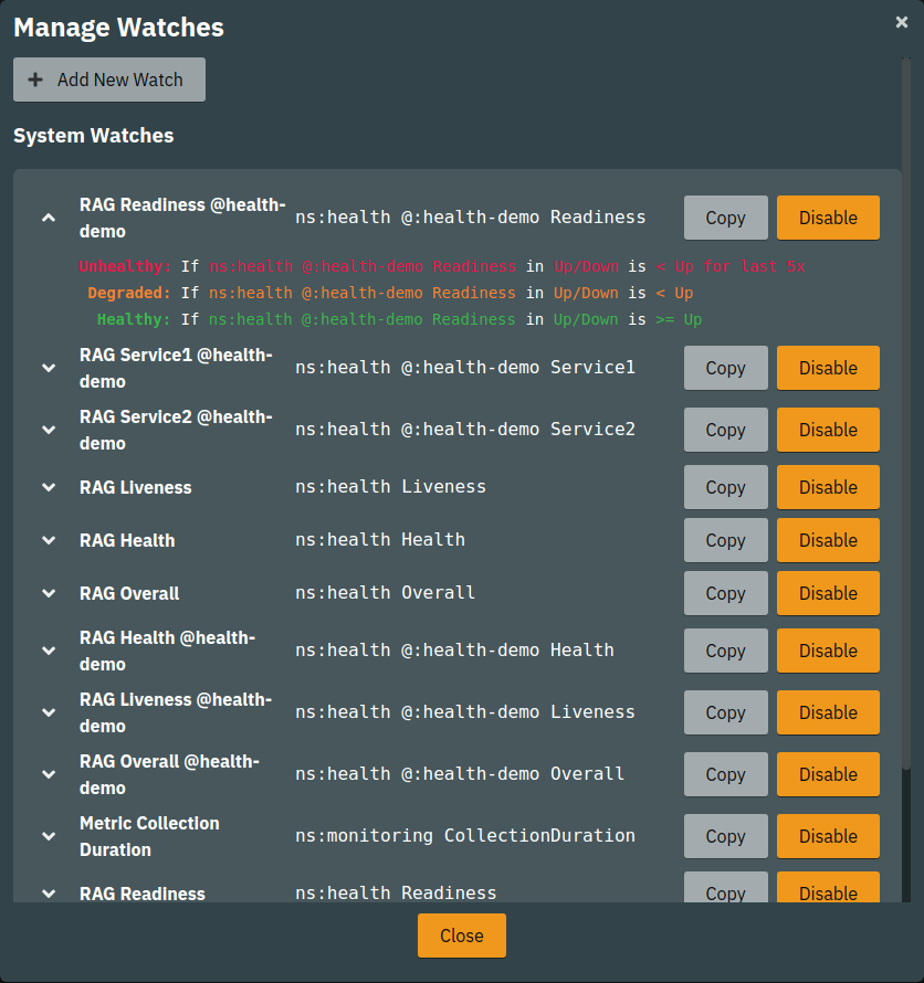
The list shows System Watches and User Watches (below if any exists). To expand and see a watches' conditions click on the down arrow or its name to toggle the details.
Creating a Watch
Open the watch management as described above and click the Add New Watch button at the top.
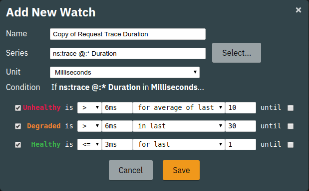
The above example shows a relatively simple watch first copied from an existing watch which then is customised. The name of the watch can be anything as long as it is unique. Each watch should have either an Unhealthy and/or a Degraded level. It is also recommended to add a Healthy level. Any value that is no matching any of the levels is White (unspecified).
After giving your watch a unique name select the metric that should be watched. Only single metrics are supported as of yet.
Select the appropriate unit for the selected metric.
Depending on the chosen unit thresholds can be given in values of this unit, e.g. when selecting Milliseconds the threshold can be given as 1s for 1 second.
| Currently there is limited knowledge what the raw number of the metrics means as not all sources do include this information. |
When name, watched metric and unit are set, check any of the states a condition should be formulated for and enter the comparison operator, the threshold and the scope.
The below table describes possible choices for each step of a watch condition.
| Segment | Type | Description |
|---|---|---|
|
Start |
Select the comparison operator to use when comparing the actual value(s) to the threshold. The comparison is of form actual operator threshold. |
|
Start |
The numeric threshold. The upper/lower limit. With the right unit selected the number can be given with a unit such as |
|
Start |
Select a scope for the actual values that are compared to the threshold. The semantics of different scopes are described in a separate table below. |
|
Start |
The length defines how many of the most recent data points of the watched metric are included in the scope of the comparison. A number with time unit refers to the number of the points, a number with time unit to the duration of points to consider for the scope. |
|
Stop |
same as for start |
|
Stop |
same as for start |
|
Stop |
same as for start |
The below table describes the semantics of the different types of comparison scopes.
| Scope | Description |
|---|---|
|
The comparison must be true for each point in the scope for the condition to be met. Similar to a all logic. The number of points included is specified afterwards. This is either a bare number referring number of points to include or a number with a time unit referring to a duration where all points within the duration from most recent point backwards are included in the scope. |
|
The comparison must be true for the single average value of all points in the scope for the condition to be met. The number of points included is specified afterwards as number of duration from which to consider points. |
|
The comparison must be true for at least one of the points included in the scope for the condition to be met. Similar to an any logic. The number of points included is specified afterwards as number of duration from which to consider points. |
|
The comparison must be true for at least one of the points available for the condition to be met. For this scope type no length is given as all available points are considered. This can vary but usually consists of the last minute of data. |
After composing the watch conditions press Save to install the watch.
| If a watch of the same name already exists the existing watch is replaced. |
System watches that originate from server modules cannot be changed. But they can be disable and copied to effectively make them editable. Find more in the edit section below.
| Watches operate on the DAS server. Their configuration is common for all users. Any change will affect other users. |
Editing a Watch
To edit a user watch open the watch manager, scroll down to the list of User Watches and click the Edit button of the watch that should be edited.
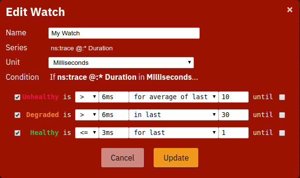
Confirm changes by clicking Update.
When changing the name of the watch a new watch is created with the new name and the old watch continues to exist. It can be deleted afterwards using the Delete button in the User Watches list.
| When changing the name of a watch to a name of an already existing watch this overrides that watch. In other words watches are always identified by their name. |
| System watches cannot be edited. To achieve the effect of a changed system watch disable and copy it. The copy is a user watch that can be can be adjusted freely. The suggested name Copy of {original name} can be changed as long as it is unique. |
Disabling or Enabling a Watch
Open the watch manager as Administrator and click the Disable or Enable button of the watch that should be disabled or enabled. The change has immediate effect and can easily be "undone" by toggling the state again. If there were any ongoing alerts due to a watch that gets disabled, these alerts stops. Enabling such a watch again then requires matching the watches start condition again.
Preconfigured Pages
Payara InSight is shipped with a dozen of preconfigured pages. These are in no way privileged over the user-created pages. It is simply a configuration identical to one user can create manually that is hard coded as a preset. Users can modify these pages freely. However, these pages cannot be deleted.
Core Page
The Core page gives an overview of some of the important instance metrics. Each instance in the grid is shown separately.
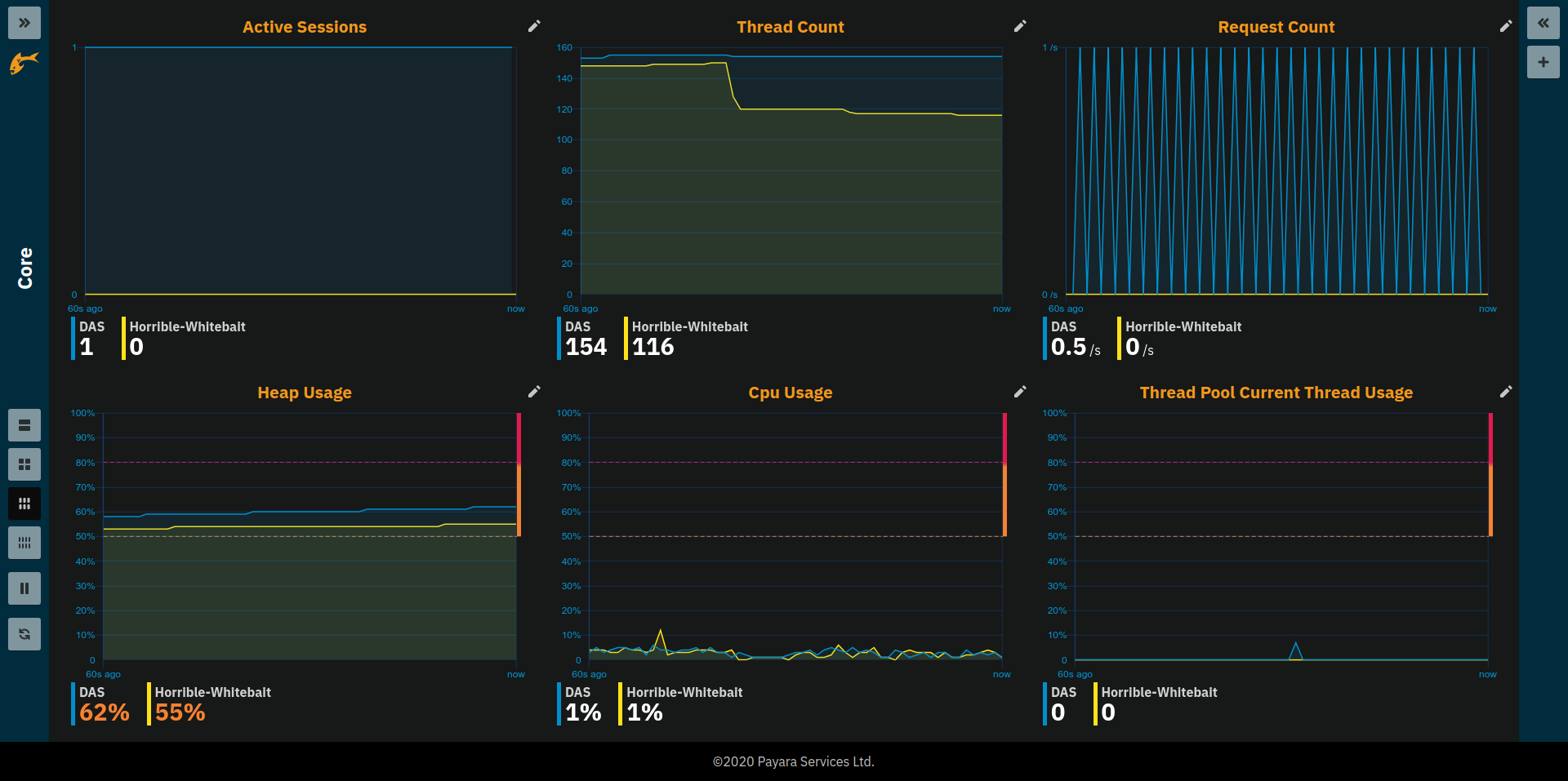
-
Active Sessions: Total number of active session for the instance.
-
Thread Count: Total number of threads used by the instance.
-
Request Count: Number of HTTP request per second processed by the instance.
-
Heap Usage: Percentage of the current instance maximum heap memory already used.
-
CPU Usage: Percentage CPU usage by the instance (not the machine but the process).
-
Thread Pool Current Thread Usage: Percentage of HTTP thread pool threads currently in use by the instance.
Traffic Light Status Page
The Traffic Light Status page (a.k.a. RAG Status for Red-Amber-Green Status) indicates the health status of the server and deployed application using traffic light signals to visualise the current state.
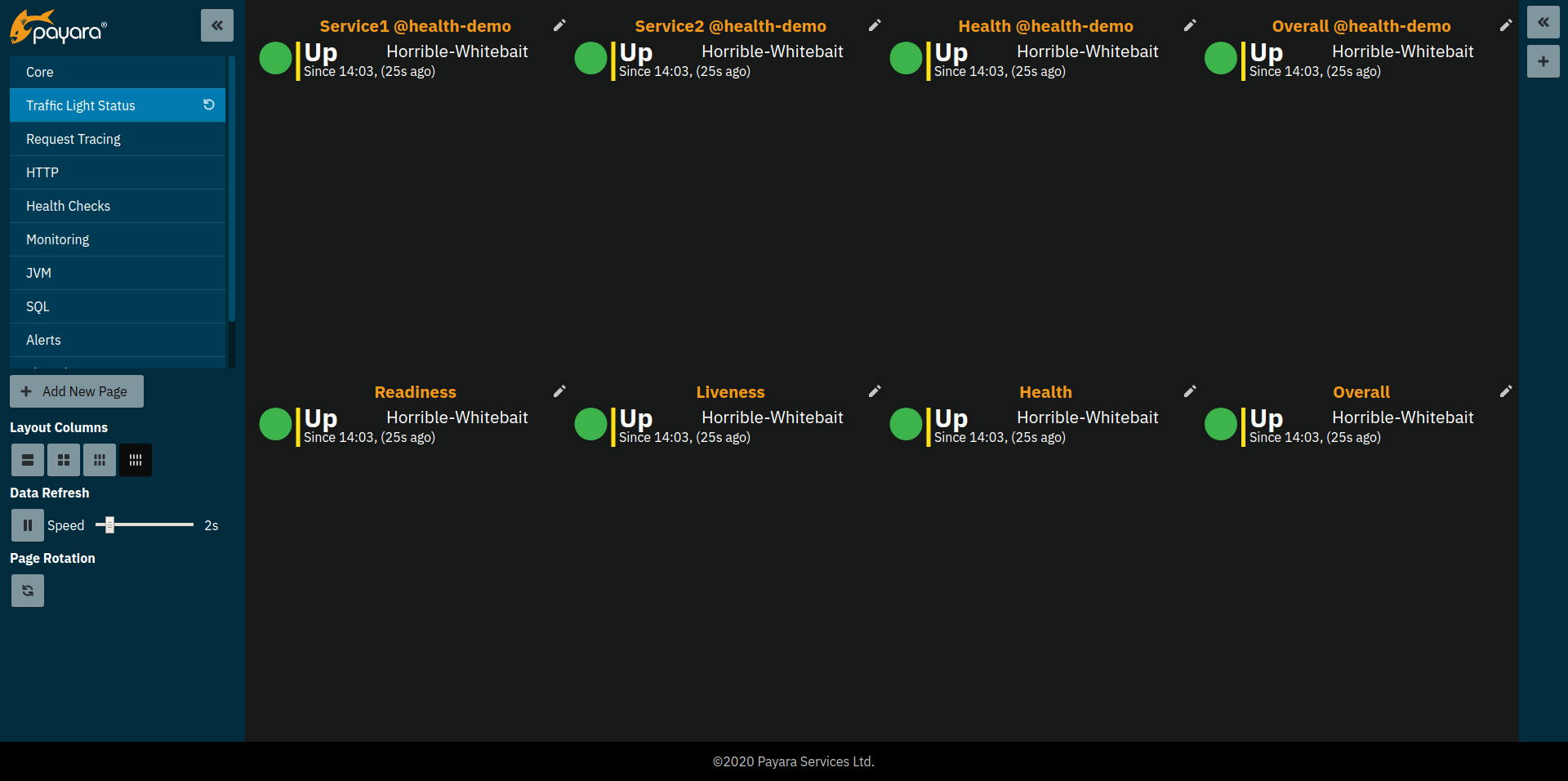
The content of the page is based on Payara Health Checks (needs to be enabled in the server configuration) and MicroProfile Heath checks of deployed applications.
In contrast to most pages this page is not static based on a manually created configuration. Instead the page is populated with widgets based on a query.
For more details on query pages see sections Adding Pages and Page Settings.
HTTP Page
The HTTP page gives a rough overview of the state of the HTTP services of each instance.
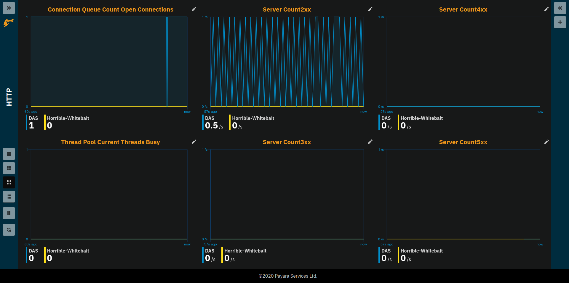
-
Connection Queue Count Open Connections: Total number of open connection in the connection queue
-
Thread Pool Current Threads Busy: Number of threads in the HTTP thread pool currently processing a HTTP request.
-
Server Count2xx: Requests per seconds and instance responding with Success.
-
Server Count3xx: Requests per seconds and instance responding with Redirection.
-
Server Count4xx: Requests per seconds and instance responding with Client Error.
-
Server Count5xx: Requests per seconds and instance responding with Server Error.
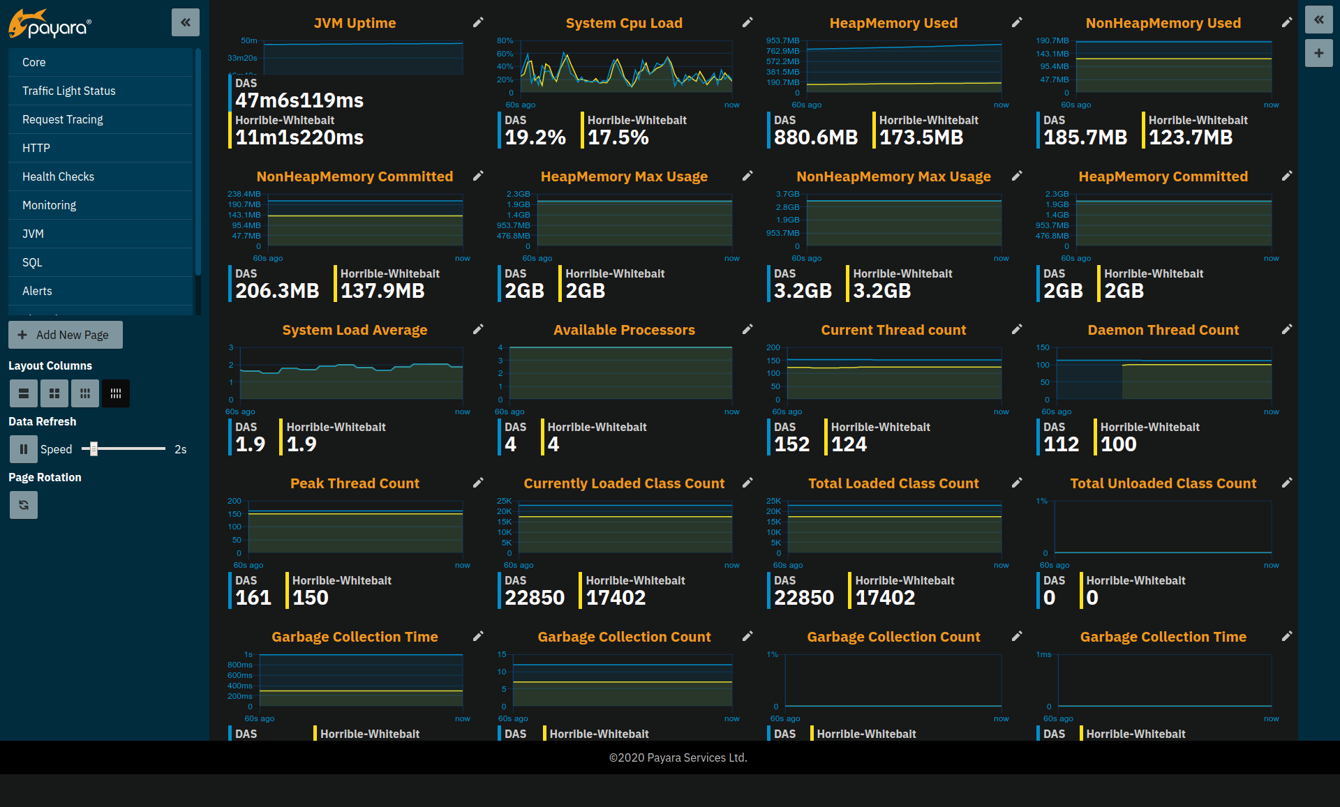
JVM Page
The JVM pages gives a general overview of the state of the JVM running Payara Server Enterprise.
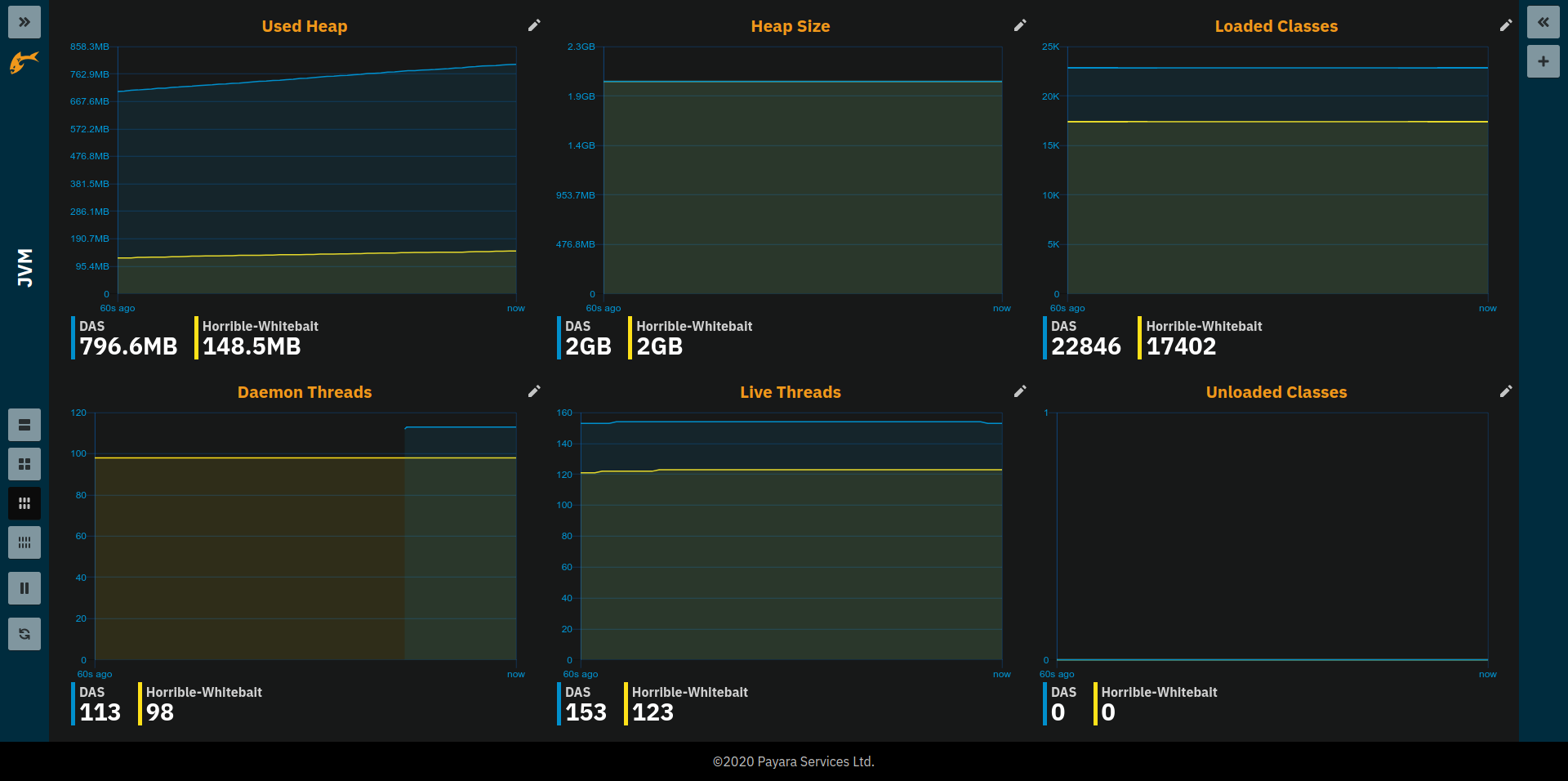
-
Used Heap: Total size of the used heap memory
-
Heap Size: Size of the committed (reserved) heap memory (OS level)
-
Loaded Classes: Total number of loaded classes
-
Unloaded Classes: Total number of unloaded classes
-
Live Threads: Total number of threads used by the JVM (including daemon threads)
-
Daemon Threads: Total number of daemon threads used by the JVM
Monitoring Page
A page that shows key metrics on the Payara InSight system itself. This is mostly useful to
-
identify problems with the monitoring system
-
cross check that unexpected metric values aren’t caused by data collection issues
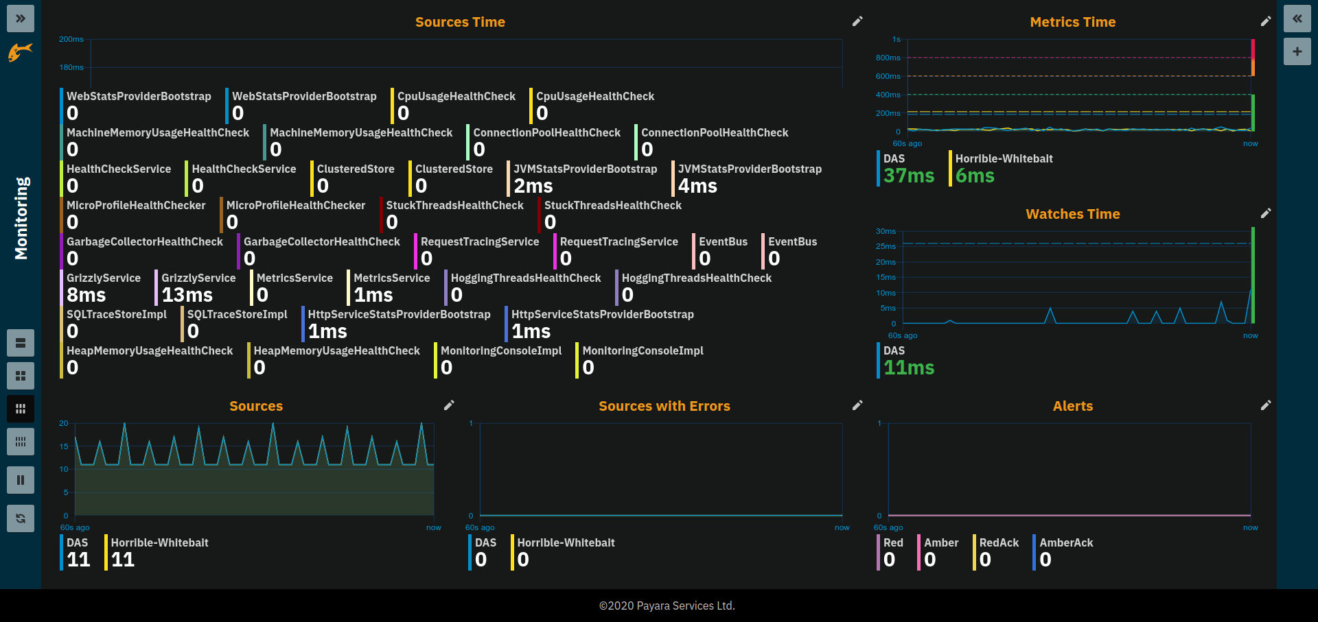
-
Source Times: Shows the duration it took to collect metric data from the individual sources within the server. Durations should be well below a second. Usually in two digit millisecond range.
-
Sources: Number of sources metrics are collected from in a particular second. This varies as some sources are collected in an interval of several seconds.
-
Sources with Errors: Shows how many of the sources that were collected caused an error during collection that potentially ends the collection of that source so that some metrics usually provided by that source might no longer be collected. This can explain "missing" metrics.
-
Metrics Time: The total time it took to collect all sources. As collection happens once every second this should be well below 1 second. This metric is watched and alerts are created should the time exceed 600ms for multiple times in a row. This time can vary a lot depending on the server configurations as sources are enabled and disabled. It can also be influenced strongly by the deployed applications as they can contribute metrics in large numbers.
-
Watches Time: The total time it took to collect and evaluate all watches. This time is less critical but it should usually be well below 1 second. Typically in the range of two digit milliseconds.
-
Alerts: The total number of ongoing (active) alerts.
Health Checks Page
A page that gives an overview of the state of the server health checks. The individual checks need to be enabled in the server’s HealthCheck configuration.
| It is not required to enabled the HealthCheck service in the General tab in case the checks should only be enabled for metrics based monitoring without causing health check notifier messages. |
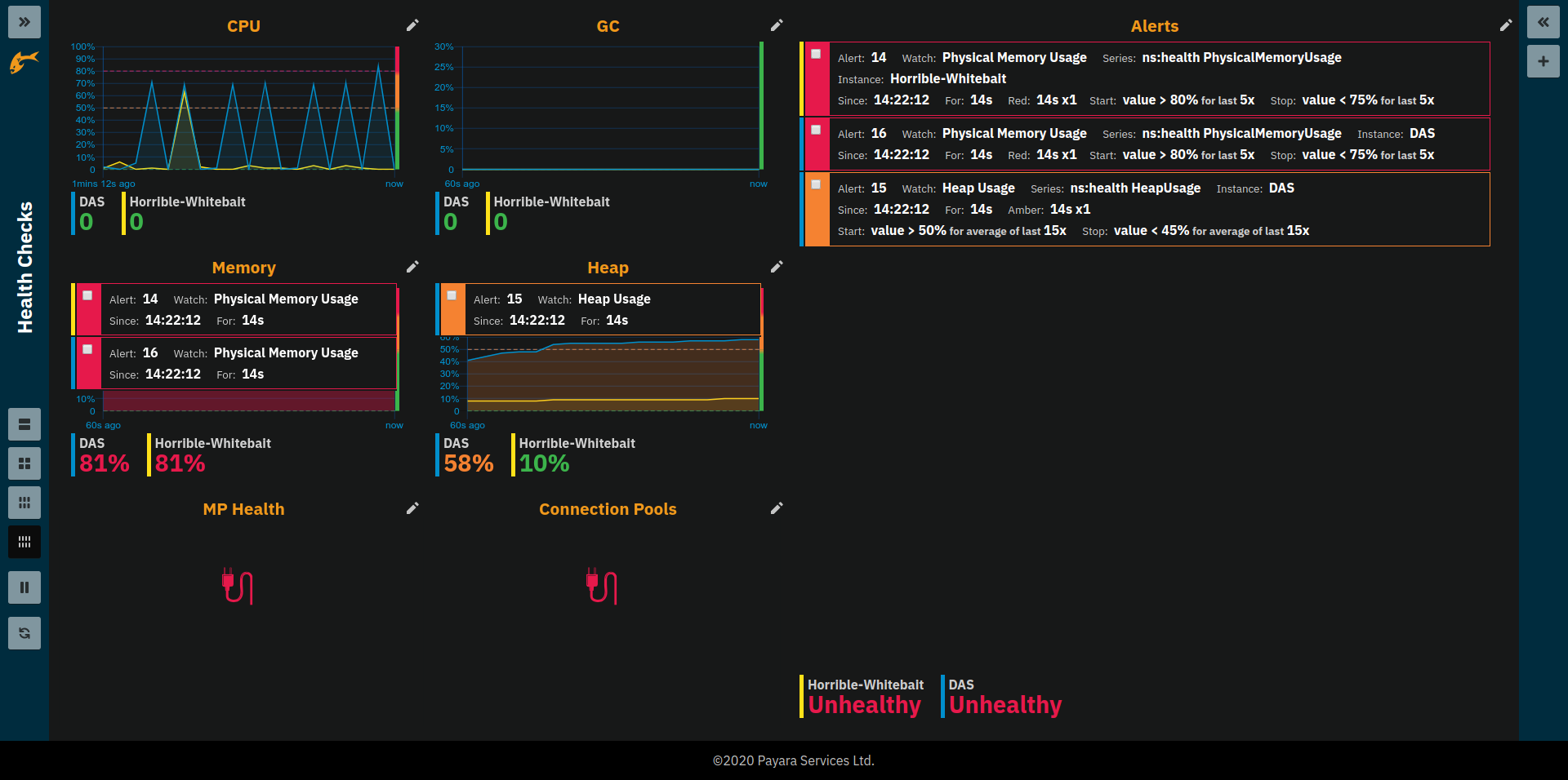
-
CPU: CPU Health Check, average percentage of CPU used by the server instance during last 4 seconds
-
GC: Garbage Collection Health Check, percentage of time used to collect garbage objects during the last 4 seconds
-
Memory: Machine Memory Usage Health Check, percentage of the total available physical memory used
-
Heap: Heap Memory Usage Health Check, percent of total available heap memory used by the JVM
-
MP Health: MicroProfile Health Check, percent of instances that respond with
UPstatus to a liveliness health endpoint request (this includes the DAS that is the only instance that is performing this check every 12 seconds) -
Connection Pool: Connection Pool Health Check, percent of connections currently used for each JDBC connection pool
-
Alerts: A list of all health check related alerts
Thread Health Page
The Threads page gives detailed information on thread health of the cluster and lists information on stuck or hogging threads. Total number of live and daemon threads are given for reference.
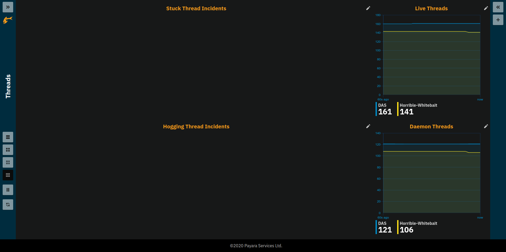
-
Stuck Thread Incidents: Table listing the most recent information for threads that are considered stuck. This is the case if the time passed since a thread started a not yet finished unit of work becomes longer than the set threshold in the Stuck Threads health check configuration. This could be because it is waiting at a lock or the operation takes a considerable amount of time.
-
Hogging Thread Incidents: Table listing the most recent information for threads that are considered hogging. This is the case if the thread’s use of the CPU in percent points is higher than the threshold value configured in the Hogging Threads health check configuration for n times in a row, where n is 1 + the configured number of retries.
-
Live Threads: Total number of threads used by the JVM (including daemon threads)
-
Daemon Threads: Total number of daemon threads used by the JVM
| Be aware that the number shown in the example image might not be characteristic. For demonstration purposes the thresholds might be set uncharacteristically low to be able to "force" entries. Usually the threshold for stuck threads should be in region of some seconds to a few minutes. The threshold for hogging threads should be well above 90% with a few retries. |
Request Tracing Page
The Request Tracing page overview page shows traces that exceeded the set threshold configures as part of the request tracing server configuration.
| If this page does not show any data, no request has exceeded the threshold or the request tracing has not been enabled. Check server config Configuration ⇒ Request Tracing. |
The Trace Duration Range widget shows all traces for the same method as a single bar. The length and position of the bar gives the range of total trace duration for all the occurrences that exceeded the threshold. The bar starts at the minimum duration observed and ends at the maximum duration observed in the last minute. The legend shows the average duration and the method traced (innermost trace span operation)
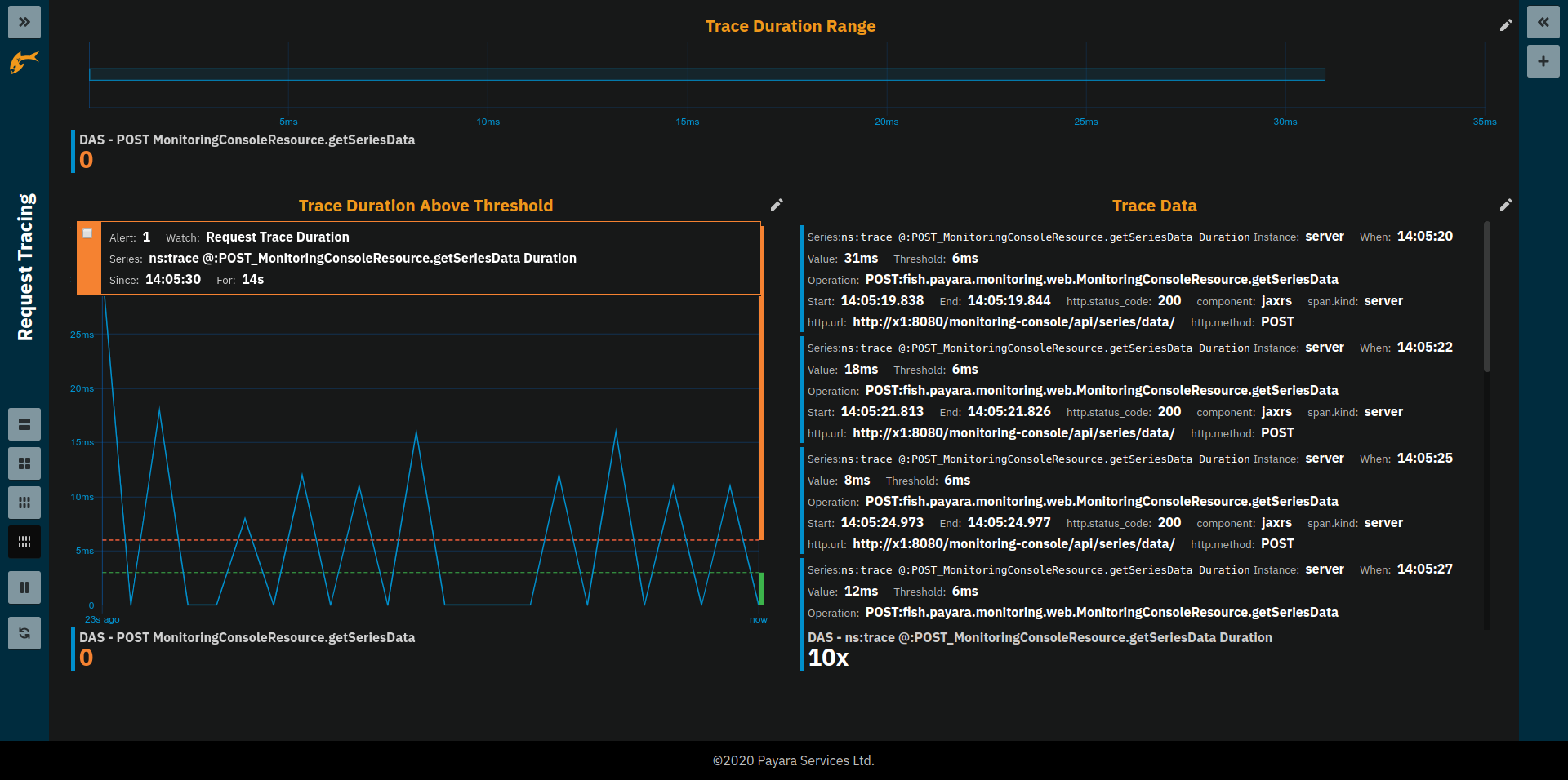
When checking the minimum and/or maximum checkbox in the widgets Extras settings the bar starts and/or ends at these "all time" values instead of the minimum and/or maximum within the last minute.
The Trace Duration Above Threshold widget shows a graph where each point marks the duration of a "slow" request at the moment the requests occurred. Possible alerts are shown on top of the graph.
By clicking on one of the bars in the overview’s Trace Duration Range widget the details of all kept traces for this method can be viewed.
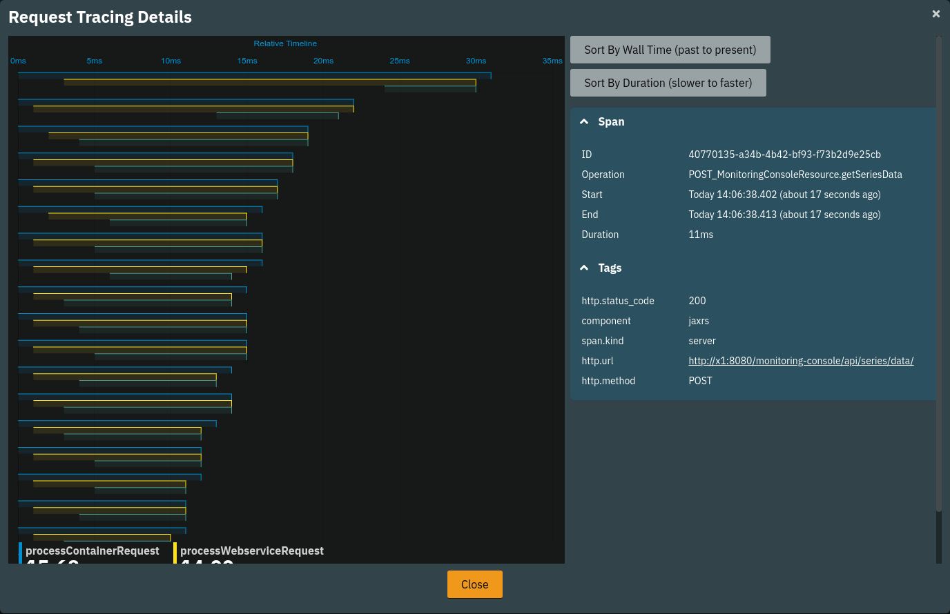
This data corresponds to the traces stored in the trace-store. For each trace, each of the spans corresponds to a bar in this graph.
The details can be sorted by wall-time or by total duration. By default, the traces are sorted longest (slowest) to shortest (fastest) total duration. On the time axis the spans are shown relative to the start of the trace.
The legend gives average durations for each of the spans occurring for the traced method.
| The detail view shows a snapshot of the data found in the trace store. Changing the sorting will reload data and reflect an updated snapshot. |
When clicking on the bars in the details view the right side panel shows the trace span details of the clicked trace span.
| Be aware that the graphs in the example images above show unrealistically low numbers due to the way that request tracing was configured. In a more realistic configuration, the durations are more likely to be in range of a few hundred milliseconds to some seconds. |
SQL Page
The SQL page gives insight into slow SQL queries for all connection pools configured in Payara Server Enterprise.
| To capture slow SQL queries the JDBC Connection Pool configuration’s Slow Query Log Threshold in the Advanced tab needs to be set to a positive number. |
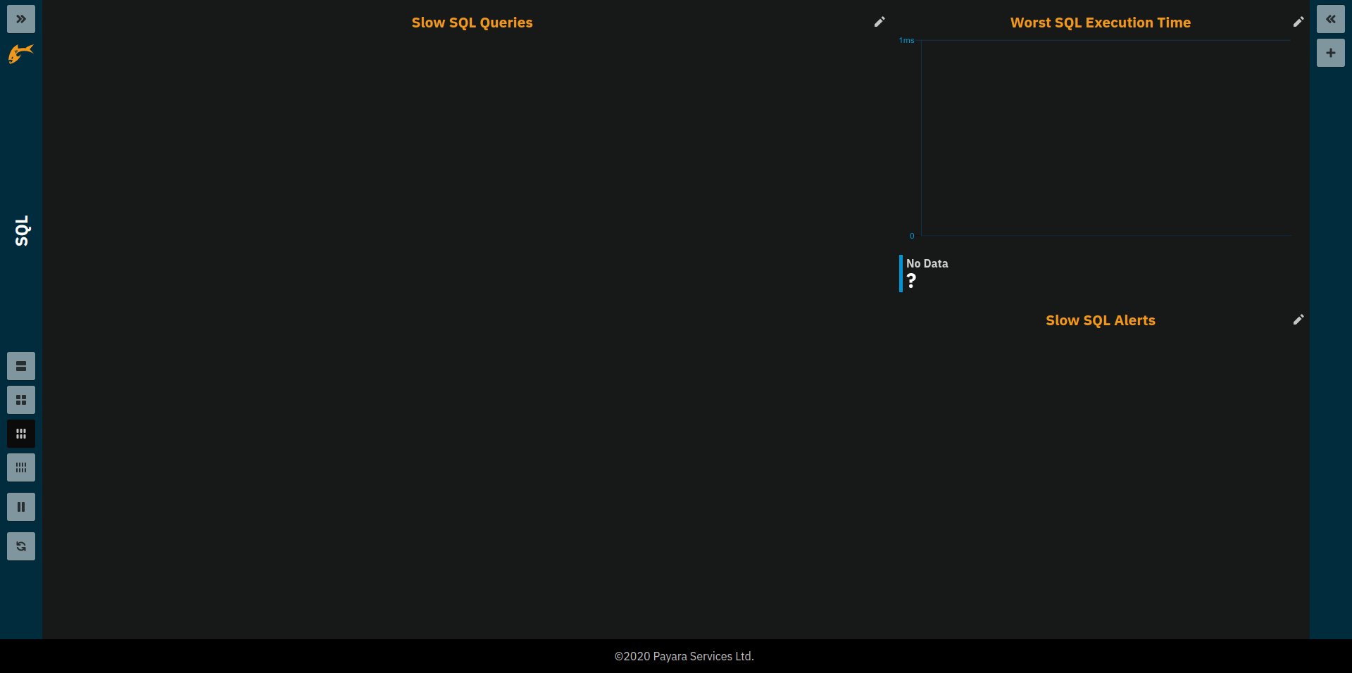
-
Slow SQL Queries: Shows SQL details for queries that were too slow. Value refers to the duration of the SQL query.
-
Worst SQL Execution Time: Shows SQL query activity. Each data point gives the duration of the slowest query run during last second. Zero means no SQL query was run.
-
Slow SQL Alerts: A list of alerts caused by too slow SQL queries in reference to the Slow Query Log Threshold given in the pool configuration. Single outliers cause a degraded state (amber alerts), outlier groups cause unhealthy state (red alerts).
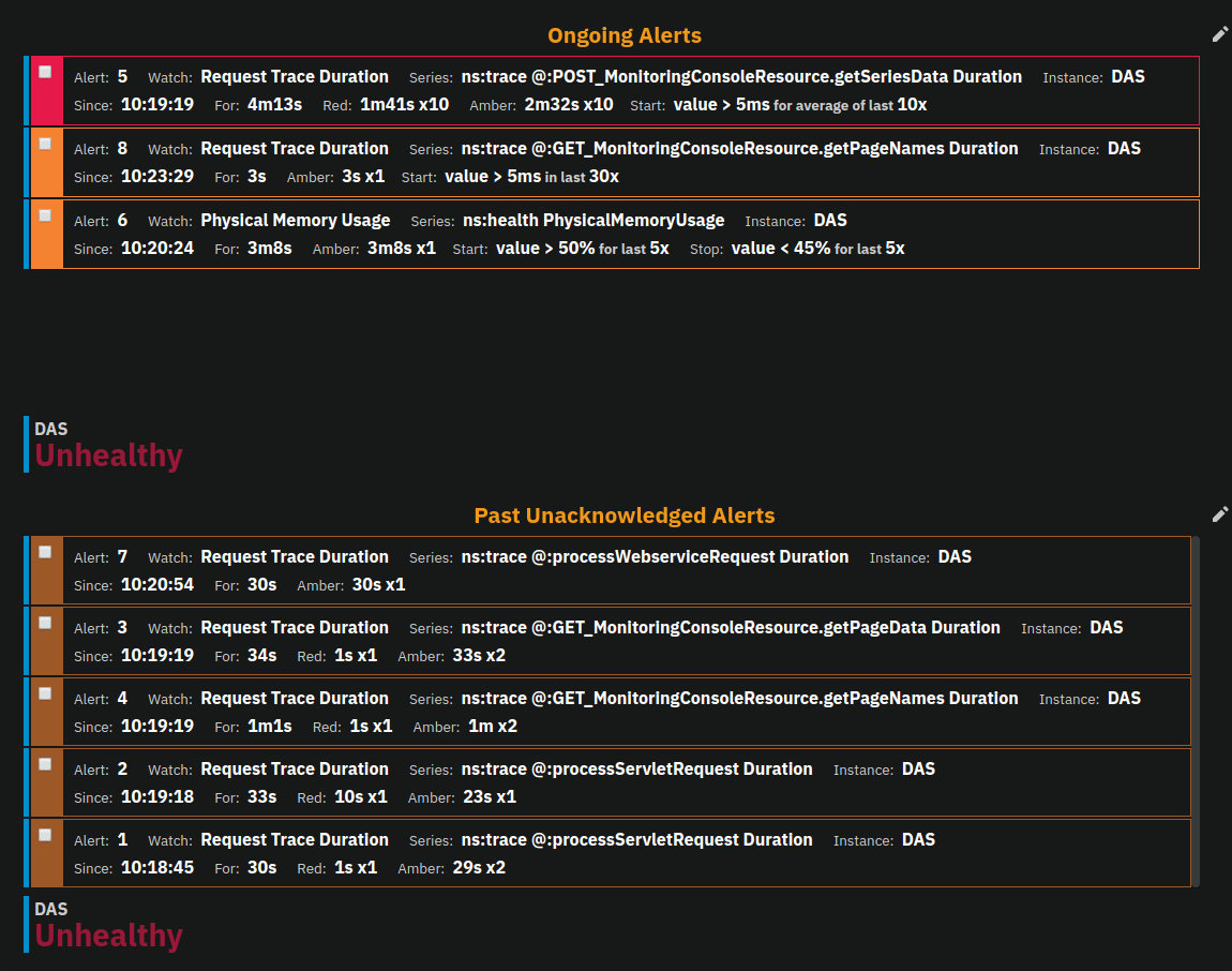
Alerts Page
The main use of the Alerts page is to check for any server alerts. The page is split into two lists: the upper list containing all ongoing alerts, and the lower list containing past alerts. As always for alert lists both lists are sorted starting with the most recent severe alert progressing to the oldest least severe alert. Annotations associated with alerts are hidden in this view to make room for more alert entries.
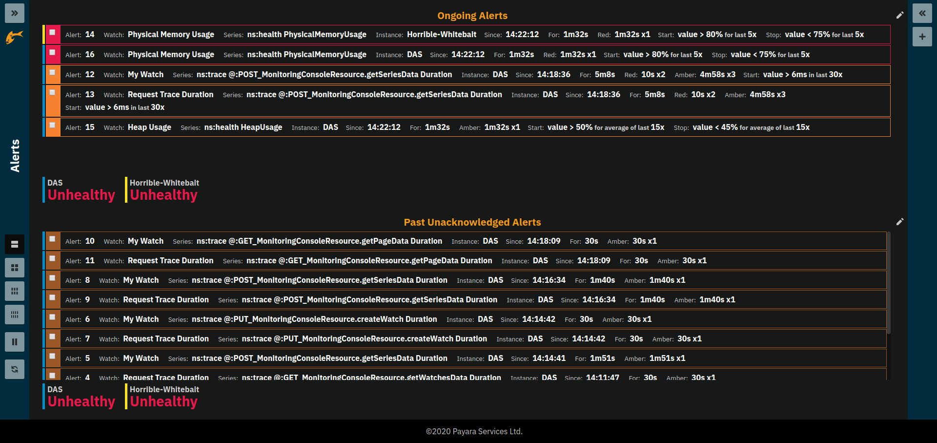
Past alerts can be managed by acknowledging the alerts which makes them disappear from the list.
Application Metrics
Payara InSight is build with the intention to make visualising user defined metrics really easy. This includes MicroProfile Metrics and MicroProfile Health checks that as defined by deployed application and server itself. It does not require and further configuration to make them available as metrics within Payara InSight.
In addition the metrics selection wizard has additional filters specifically filtering on the properties of MicroProfile Metrics.
When MicroProfile Metrics get translated to InSight series the MP tags become the @ group of the shown series key, the MP metric stays the metric name.
The Application Metrics page is a page that is automatically populated will MicroProfile Metrics based on a query. This means the metrics shown on the page vary depending on what metrics are defined in applications and the server as MicroProfile metrics.
When populating the page the widgets are configured automatically based on the information available in MicroProfile.
For more details on query pages see sections Adding Pages and Page Settings.
Experimental Features
This section includes features that aren’t fully complete or integrated or which might change drastically or even be removed in future releases.
Pattern Data Series
The term series is used for the name or key for a particular metric. Each metric has a unique key or series name. Usually these names use tags for form key:value to categorise metrics into groups.
For example:
ns:jvm MetricName
ns:jvm @:groupName MetricName
The series names shown above exemplify conventions used throughout Payara InSight.
The first grouping level usually is the ns (short for namespace), the second the @ (short for group).
In the example the metrics belong to the jvm namespace and the groupName group within that namespace.
When metrics are selected using the wizard only fully qualified metric series can be selected. This is a limitation of the selection wizard. On the technical level a series can be either a fully qualified series name or a series pattern. Patterns contain wild-cards to match not only one specific metric but a set of metrics. Wild-cards can occur in different places. Examples of this can be found in the query page’s Query Series setting.
For example the Traffic Light Status page uses the query *boldns:health ?:* *.
A *bold* wild-card for the metric name means any metric name.
The *bold?:* combines a wild-card (tag) value (*bold*) with a wild-card tag name (?).
This means any tag name (including none and multiple of them) with any value.
So the full *boldns:health ?:* * matches any series that is in ns:health, weather or not is has more tags,
while *boldns:health * only would match series in ns:health which do not have further tags.
This feature can be used to automatically show all metrics of a certain pattern in a single widget as it is done by the request tracing page.